SCOPE OF WORK
UI Design/UX Guidelines | Website content
August Infotech is a software and product development company. Just as their name takes imperial roots, deriving from the King Augustus, their virtue stands tall with most of their clients acquired through word of mouth. August Infotech takes pride in providing lasting digital experiences to all, be it a small startup or a giant conglomerate through their diligent web development services.
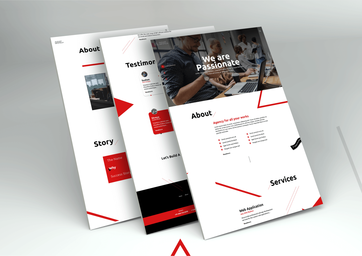
Paperclips worked with them to design a website which represents their company goals, services, values, work ethics and working style. Their primary target audience is different agencies who are looking for technical solutions (web-application, mobile app development, e-commerce and CMS) in their organisation.
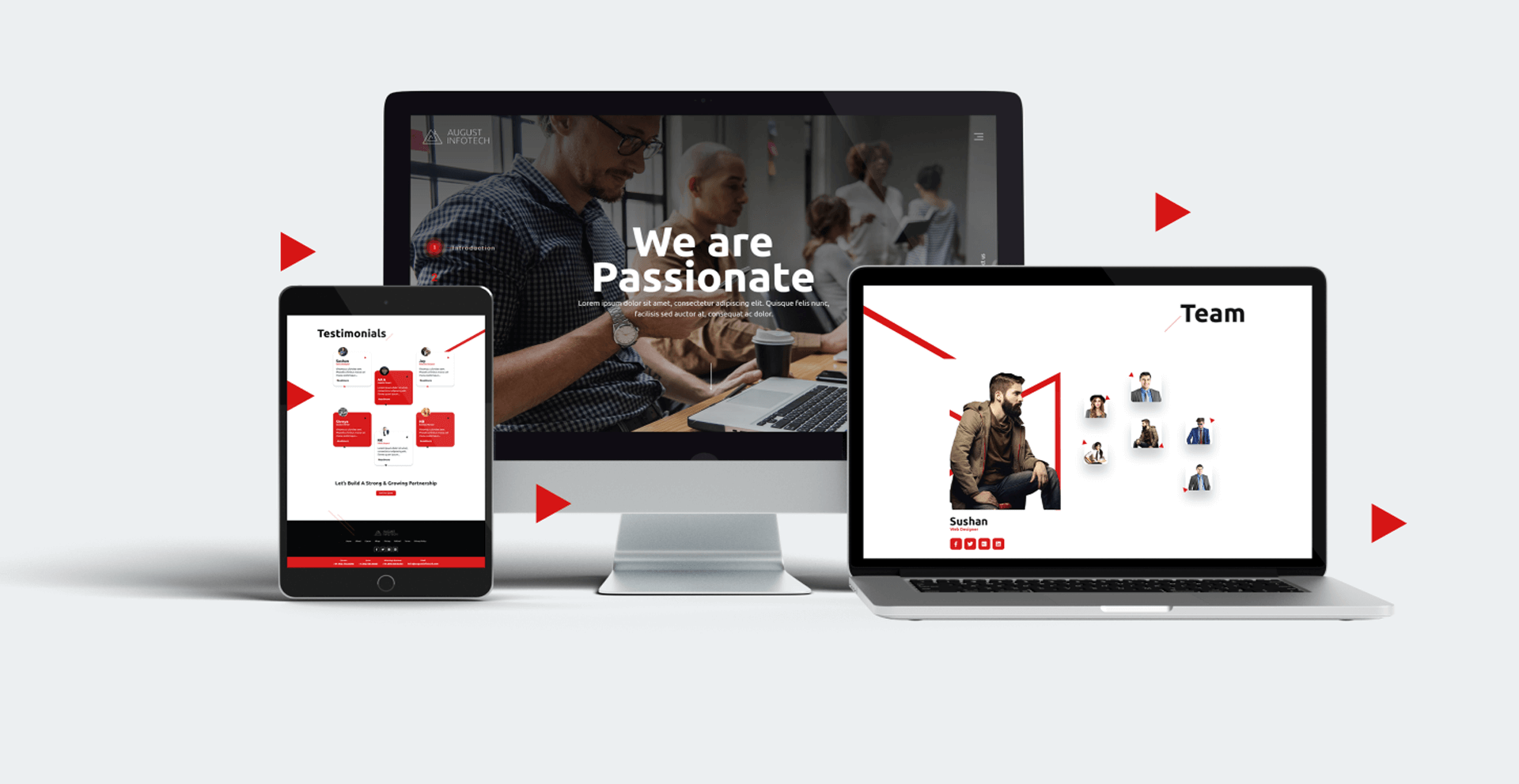
Due to the increasing bounce rate on their previous website, they wanted a clean, minimal and user friendly layout that would let the viewer stay on the website for a longer duration.
Colors of their web kingdom
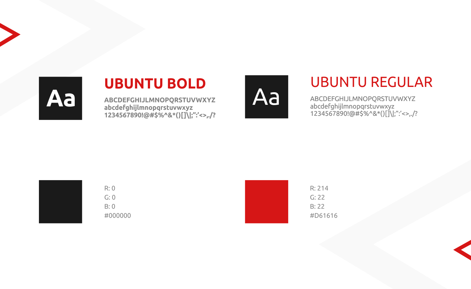
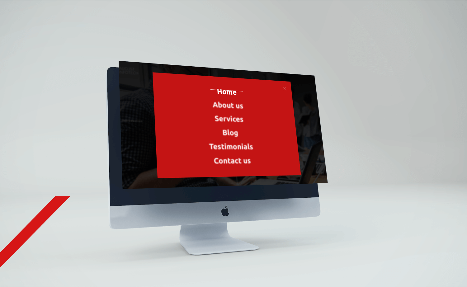
Red, black and white colors are their brand colors. Red denoted their enthusiasm of taking new web development projects and power to experiment in the areas of development whereas black and white were used as theme colors.
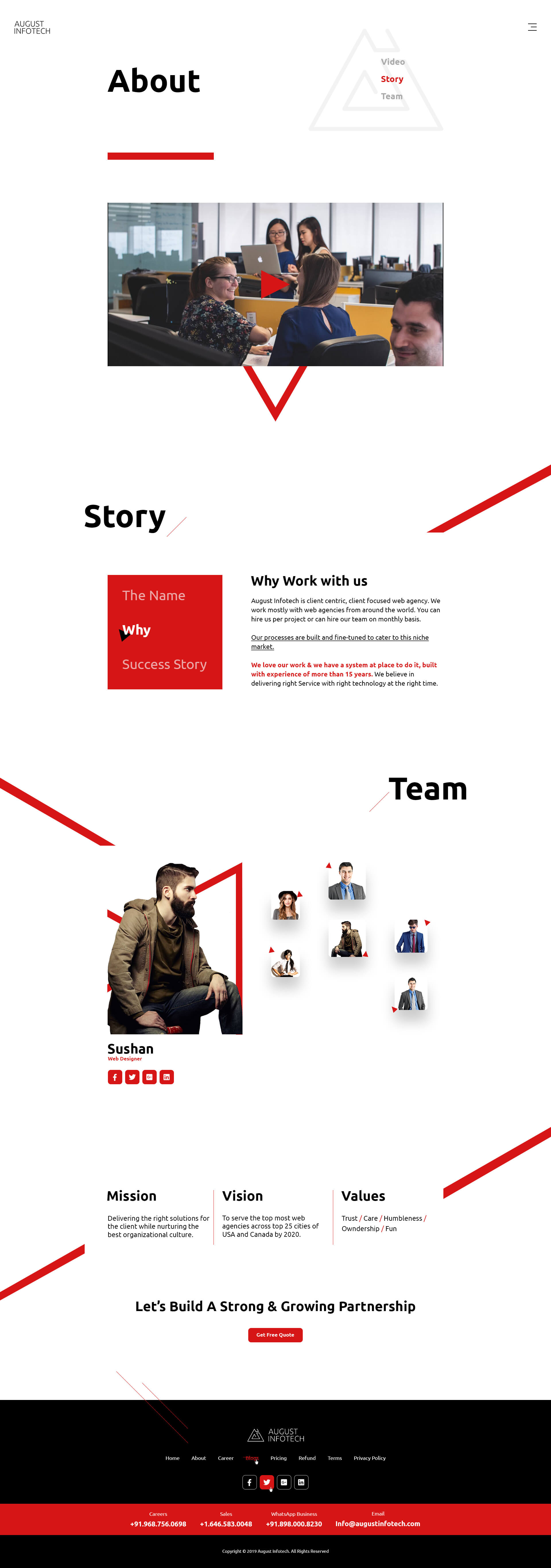
Aligning their identity with the logo.
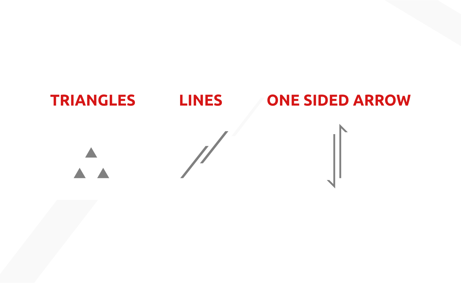
Continuing the same brand language of lines and triangles from the brand logo of August infotech, we developed their web design identity with slanted lines and arrows.
August Infotech Typeface
For a corporate brand, like August infotech, which believes in adopting new changes and is open to new experiments, we used Ubuntu fonts as it has variations of small, bold and little fonts. The smooth edges of the font show the quality of the company to innovate and evolve in web development.
To ensure a seamless and an eye pleasing experience for the viewer, we bifurcated the paragraph titles, keeping the headings at eyesight level and font size as 60.
To keep the people engaged with the website and reduce the bounce rate, we created an interactive design. Also, we defined the UX guidelines on how the design elements can be animated on the website.
Toning it up
Knowing the personality of the founder and gauging the work culture of the organisation, we defined key attributes that should be reflected in the look and feel of the website.
Key attributes :
Sincere, professional, quality systems and responsible team. We came up with paragraph titles, phrases and banner headers on the homepage with respect to the key attributes and website development glossary in order to convey the same message throughout the website. Kingdom glossary was added in some sentences to connect with their company name, inspired from King Augustus.
For example : Replacing the “About us” tab with “Decode August’s Realm”.
Replacing testimonials section with Noble Endorsements. The content for this section was as follows :
We aren't fans of blowing our own trumpet, but here are some words from our royal clients.
Similarly, under the title, let's get acquainted, the content was as follows : Make us a part of your core team and enjoy the reign of hits and wows. Be our Guest.