SCOPE OF WORK
Brand Positioning | Logo | Design Identity | Corporate Stationery | Company Profile
Mastermind has been serving around 3000 Entrepreneurs from the last 8 years with a prime goal of job creation and growth of MSMEs. But there was a void in the way the brand was put across in the market. Their vision wasn't effectively translated in their brand identity.
For a long time, Mastermind has been calling itself just a training and consultancy firm but looking at their testimonials, we realized that their contribution was much more.
Bringing forth the Masterminds
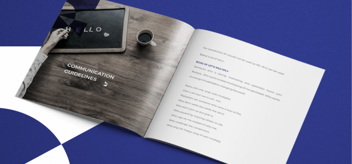
Everybody wants to be better but nobody wants to be told that they need to be better. We indirectly show our consumer that they lack something when we tell them to get trained. We built the brand strategy by tapping the growth mindset of the consumer. Therefore, Mastermind underwent a transformation: From a training and consultancy firm to a platform for collaboration. This basic human psychology formed the crux of the brand strategy. We further used this strategy to reposition Mastermind as a home for entrepreneurs to multiply in various aspects of their business.
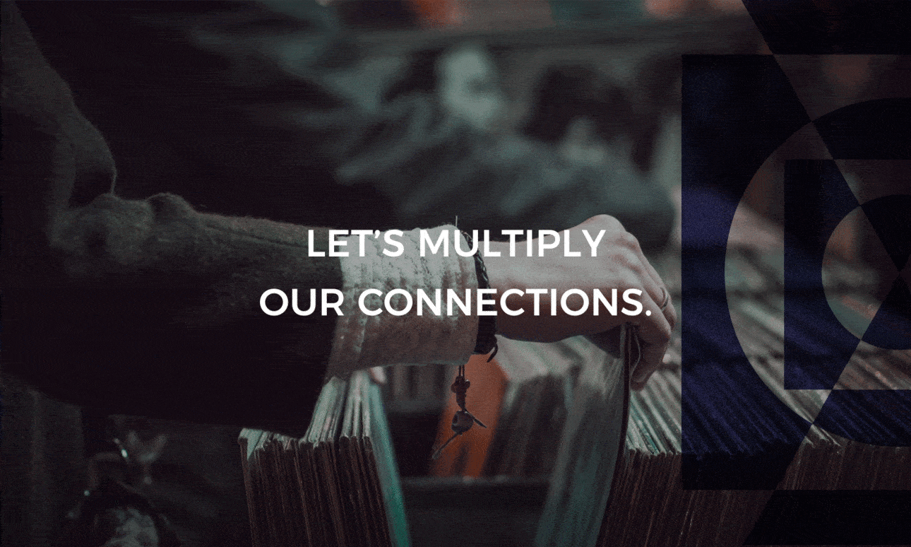
Paperclips revamped the brand by changing the brand name, logo, tagline, brand identity and brand communication. The tagline Let's Multiply is also a philosophy which is a call for collaboration for anyone who is looking to help entrepreneurs in their business.

Mind on paper
The brand language is extended to their corporate stationery as well.
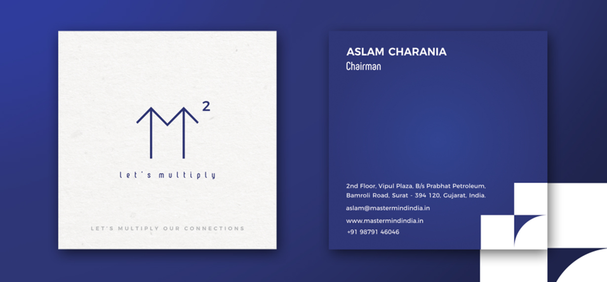
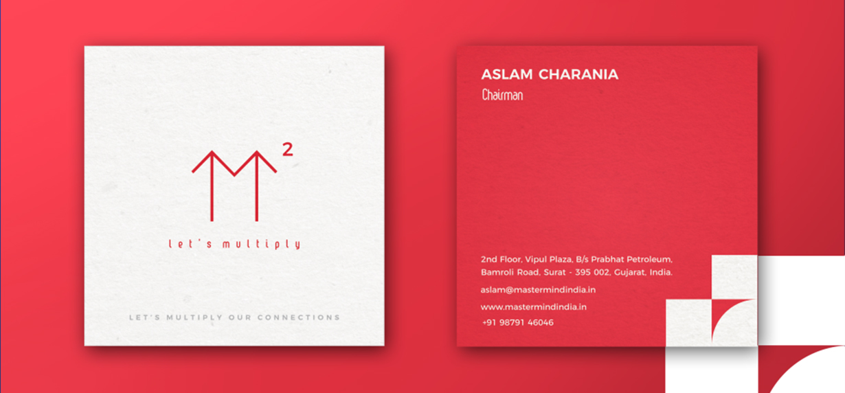
Visiting card : Let's multiply our connections
Letterhead : Let's multiply our business
Envelope : Let's multiply our relationship
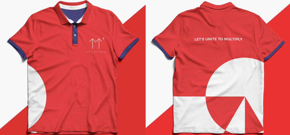
Uniform : Let's unite to multiply
How we shaped the mind
Overlapping shapes form the brand identity, wherein, the circle represents the mind, the square is a connection to the square of M and triangle for the arrows. The overlapping technique used in the shapes further depicts our positioning of Let's Multiply.
The mind for colors
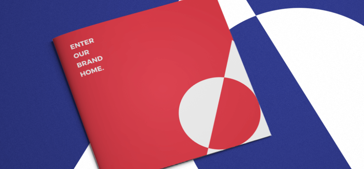
With the careful combination of Red and Blue as Brand Colours, we have conveyed the perfect balance of peace in the fire of multiplying. The Brand Book or Brand Home defines the identity transformation, brand progression and also the Let's Multiply anthem which is the spirit of each employee working at M square.